There is an important factor in how we dress that I don’t think we’ve ever discussed explicitly on Permanent Style, which is how subtle or showy an outfit is.
When we talked almost entirely about tailoring, worn largely in offices, it was clear that dressing in a showy way was bad. In those narrower, professional environments, the aim was obviously to dress simply – with understated colour combinations, a subtle silhouette.
When we talk about casual clothing, the choice is less clear. The range of clothing multiplies 10 even 100 times.; the situations vary hugely; and our aims – what we want to say about ourselves – are often different too.
But there are still factors we can use to consider what looks good. One is execution; another is style paradigms. The most important of all might be how subtle or showy we want to be.
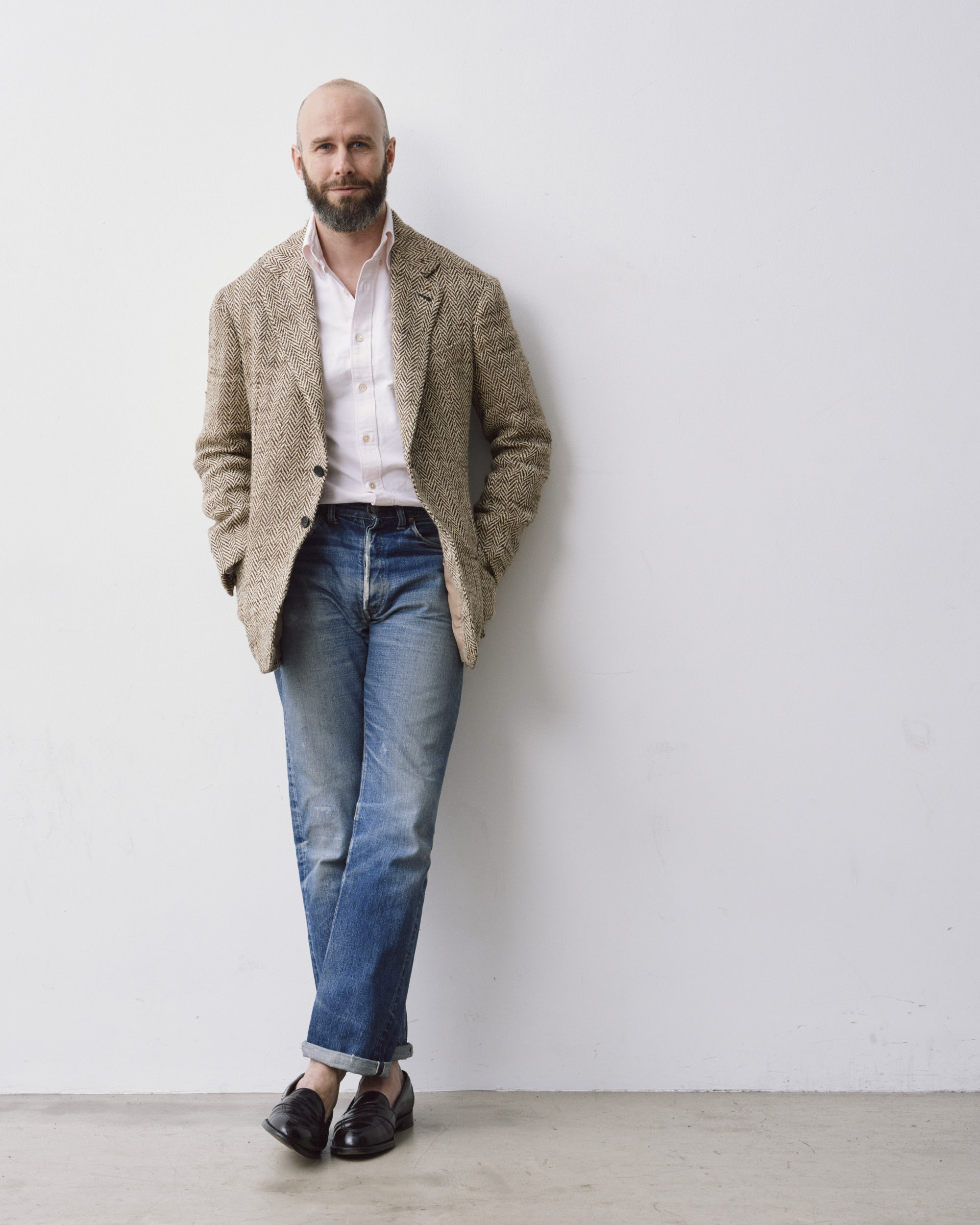
On Permanent Style we often discuss particular outfits, such as a jacket with jeans. I might comment that I prefer a soft-shouldered jacket for that kind of combination. That it’s easier with a rougher jacket material, and a smarter jean.
But underlying that is an assumption that our aim is subtlety – a look where, as we often say, you simply appear well dressed.
That might not be the case. Someone might also look great in a cashmere square-shouldered jacket and faded jeans. The difference is mostly what kind of look we want. When I say I wouldn’t wear my A&S jacket with jeans, it’s because there’s an implicit aim of greater subtlety.
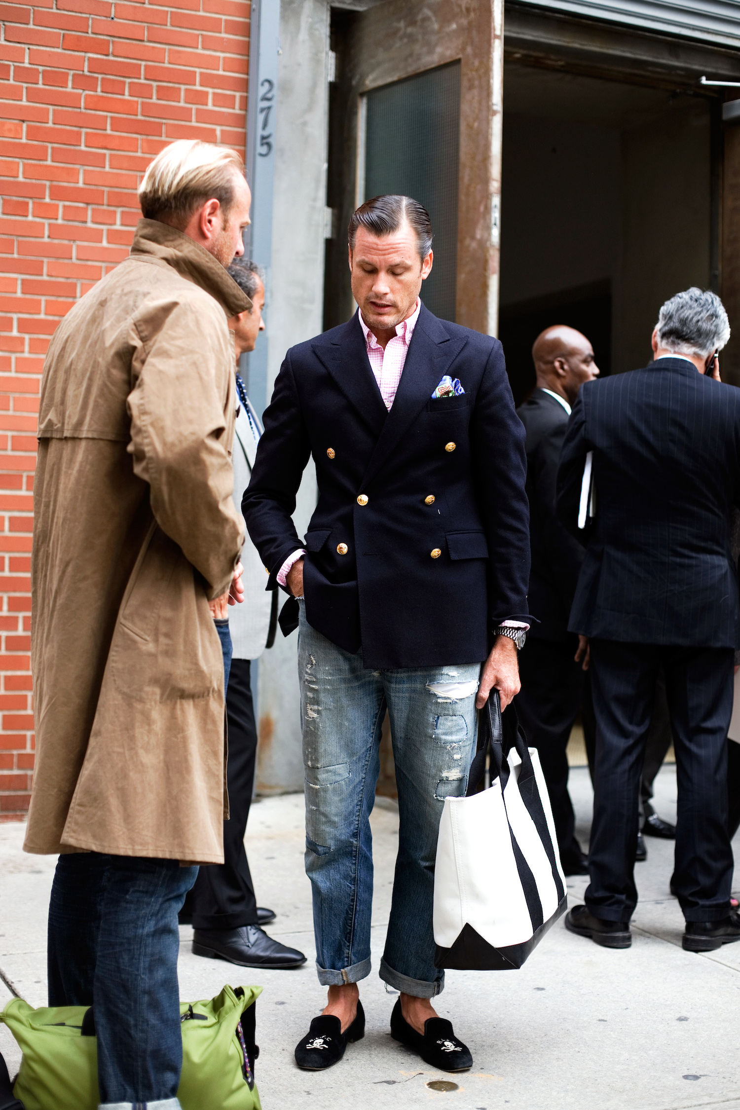
I posted an image recently wearing jeans with a black T-shirt and Whitcomb jacket. A reader questioned whether I now thought English jackets with jeans ‘worked’.
The answer is no, not for how I normally dress. But I was playing around with something different, something more showy.
Importantly, whether an outfit is subtle or showy, we can often agree on whether it has been put together well – there is something objective in how it has been executed.
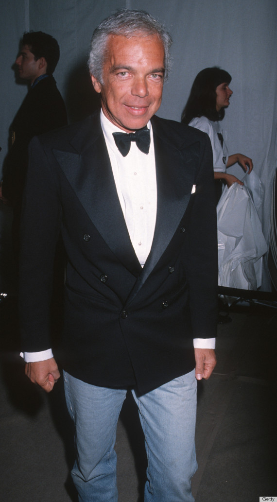
I wouldn’t want to dress with as much clash and contrast as the gentleman from Ralph Lauren above, for example. But he and I would probably agree that the look is better with loafers than with chunky trainers. Equally, if it were worn with trainers he might want red and I might prefer ecru, but we would probably both agree that a canvas tennis-shoe style would look better than Air Jordans.
When more showy looks like the one above are shown on PS, people often describe them as ‘fashion’. But they’re not necessarily transient, as that term implies. Rather, they’re aiming at something different, a showier look.
Examples often come up on PS in discussions of ‘high/low‘, because there’s a deliberate attempt there to be unusual, to create contrast. Whether Ralph Lauren looks good in a dinner jacket with jeans (top image) is meaningless without an acknowledgement that he is being contrary. Whether you like that approach and whether you think it’s done well are different things.
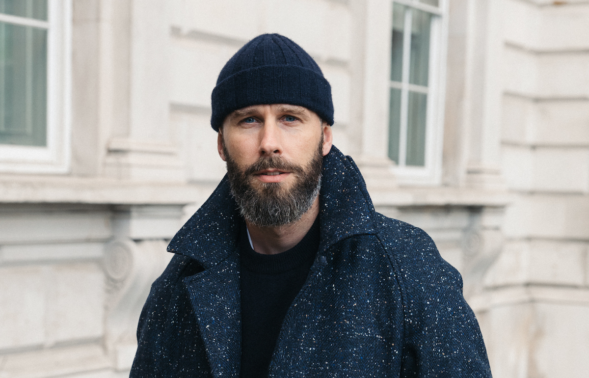

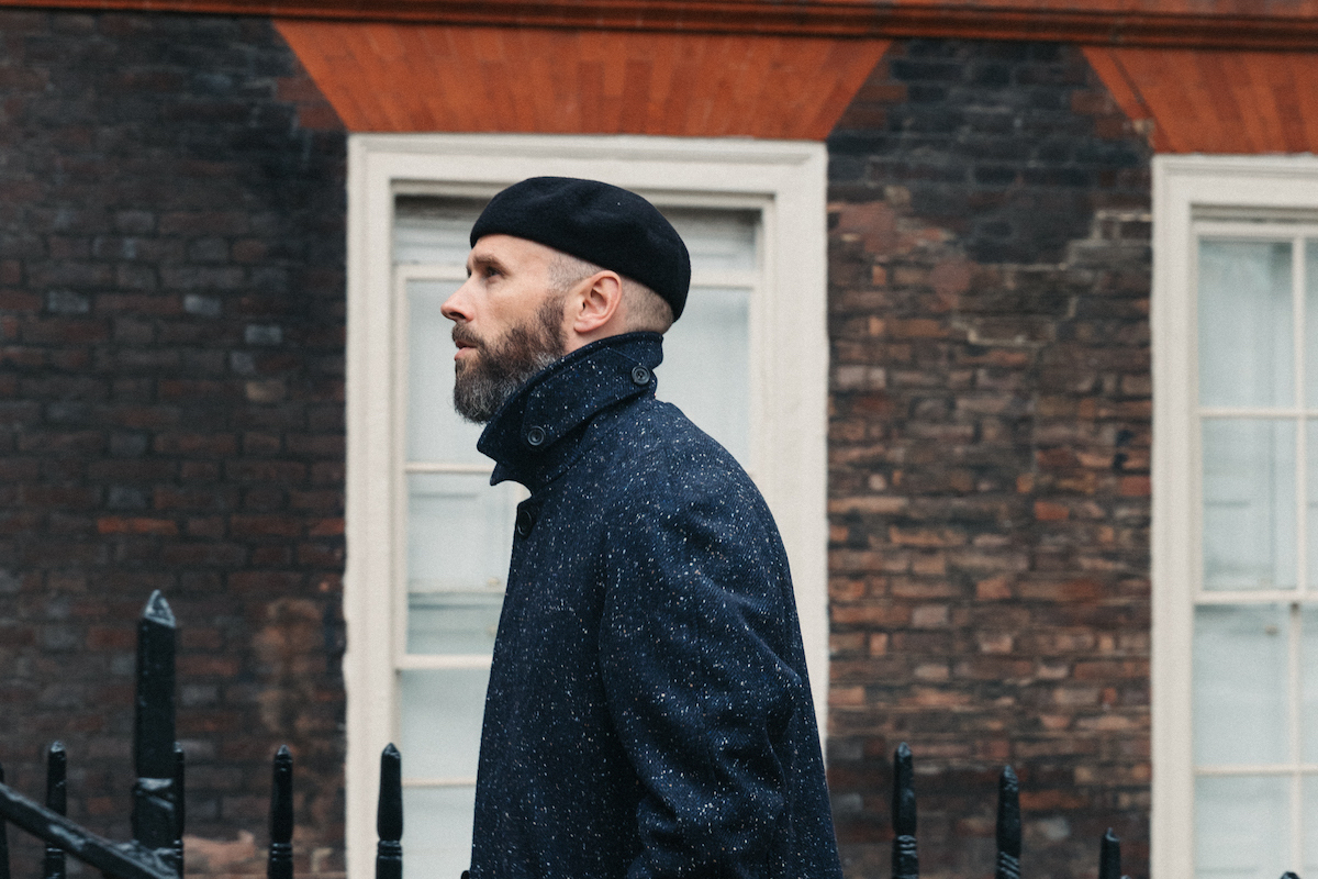
Let’s take some examples. If you’re selecting a piece of headwear to wear with a tailored overcoat, you could go for the most anonymous, a beanie; you could pick something a little more contrasty, like a baseball cap; or you could don a downright unusual piece, such as a beret.
That’s me above in all three. If I had a photo, I could also include something even more showy, like a cowboy hat.
Each of these, I would argue, could be executed better or worse. A big, bulky beanie wouldn’t suit the clean lines of the coat as well as that PS Watch Cap. A beret in a bright colour would look cheap compared to that black one. But the three choices above, I think, work well.
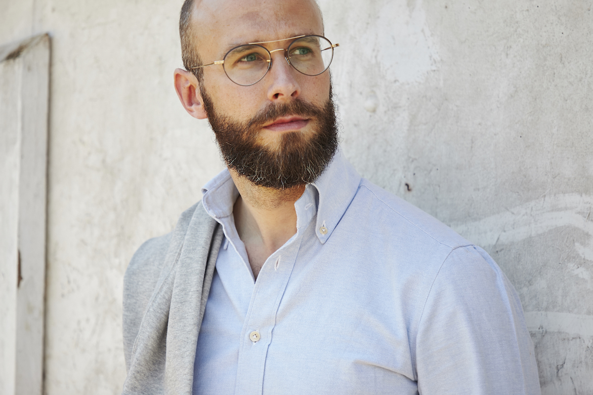
Accessories are an easy way to show this. With glasses, for example, you can wear a subtle tortoiseshell panto, a wire-rimmed aviator, or a slightly odd shape like small frame with a cut-off top (below). Other men might be even more extreme than this, choosing chunky black frames or primary colours.
But all the styles could be executed well or not. Most obviously in whether the size of the frame suits your face, but also whether it goes well with the rest of your clothes.

Readers sometimes ask questions like, ‘But why would I want to subvert tailoring?’ or ‘Why would I wear a chore coat if a blazer is more flattering?’
The answer usually is, because people want to achieve different things with their clothing. One is physical flattery, certainly, and it’s one that too many men ignore. I would still maintain, as I did many years ago, that fit is the most important factor of all.
But it’s not the only one, and those others include things like your environment (office, social group) and what you feel expresses your personality.
A navy blazer may suit more men and more skin types than a black one, but if someone wants a different look, one that (in their locale) feels less corporate, then black may be a better choice.


A blue oxford shirt with jeans is a subtle choice. A denim shirt with jeans is less subtle. A full-on western shirt with its bells and whistles is pretty showy.
This kind of spectrum is not hard to understand, but it’s good to be able to separate it from other factors, such as associations. I’m unlikely to wear jeans and a western shirt in the same denim not because someone might think I look like a cowboy, but because it would be too showy for me. Kenji of Bryceland’s does it and it looks great.
This idea of subtle or showy has been implicit in many discussions on PS over the years. It’s why we call something more of ‘a look’. It’s what I mean when I say something is ‘easier to wear’.
I think it will become increasingly important as we discuss casual clothing more. I always tend towards the subtle end of this spectrum, I know most readers do, and it’s the kind of style we will always push. But defining our terms makes our preferences, and discussions of them, clearer.
For a related discussion of subtle and showy, see this previous article on the double-brown outfit above. Although hardly outrageous, another colour of knit – grey, fawn, navy – would have been that bit more normal.